Logo Styles: How to Choose Which One is Best for Your Company.
- Oct 27, 2023
- 2 min read
Updated: Nov 13, 2023
Having a tough time deciding how you want your logo to look?
A good jumping off point is to decide on the graphic style, and there's actually 7 of them!
We will give you a brief walkthrough of what each style consists of, and examples to help you make the right choice for yours.
**Remember, a great logo can be recognizable when it is only black and white and can be scaled to 1/2" or a mile long!
Monogram (or Lettermark) logos
Wordmark logos
Pictorial mark logos
Emblem
Mascot logos
Combination Mark
Abstract logo marks
Monogram/ Lettermark Logo

This style usually consists of just the initials of the company. Usually a great option for businesses with lengthy names that want to shorten it up and typography based.
Well known examples:
HBO, IBM, NASA
Wordmark Logo

This style is very similar to the Lettermark, but includes the full company name in a Typography based logo. Best used for company names that are unique and memorable by themselves, then paired with a strong and custom form of type.
Well known examples:
Coca-Cola, Visa, Google
Pictorial Logo

Pictorials are also known as Symbols. These are graphic based, usually simpler like an icon and when branded correctly with enough exposure, becomes recognizable without any words or text.
Well known examples:
Apple, Target, Twitter
Emblem Logo

Emblem logos usually include an icon/symbol with typography that is enclosed within a badge or shield style frame, or shape that acts like a seal. These can have a classic, or more modern look. These are often bold and stand out among other types.
Well known examples:
Starbucks, Harley Davidson
Mascot Logo

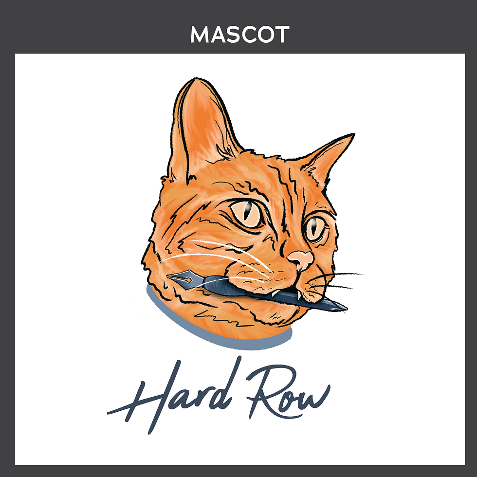
Mascot logos are simply illustrated characters that represent the company... Think cereals that are directed at kids- because there is a lot of them! These are perfect for companies that are trying to portray a wholesome, and family-oriented feel.
Well known examples:
Planter's (Mr. Peanut), KFC (Colonel Sanders), Wendy's (Wendy)
Combination Mark

Combination Marks are probably the most popular logo style. They include graphic elements with typography, but aren't enclosed within a frame like emblems. Great for companies starting out to gain brand recognition if they plan on dropping the text to go by a Pictorial Logo only someday.
Well known examples:
Burger King, Doritos
Abstract Mark

Abstract Marks are like Pictorials, but not an instantly recognizable symbol (like an Apple). These are more custom designs that don't necessarily make up a bigger picture. A lot of Abstract Marks are able to convey what a company represents without using a specific icon.
Well known examples:
BP, Pepsi, Adidas


Comments